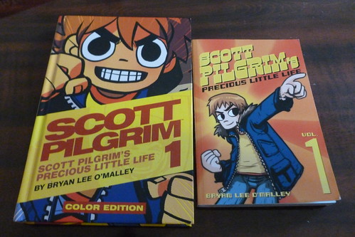
The best comic book news (so far) this year is, without a doubt, the announcement of color reprints of Scott Pilgrim. I’m a huge fan of the original graphic novels and of Bryan Lee O’Malley so I was completely stoked to see what this new version would bring to the table.

“But Dan,” you might ask, “aren’t you generally opposed to remaking and endless tinkering with media a la George Lucas?”

You know, random internet question asker, you’re not completely wrong. I don’t really care for all the editorial changes in Star Wars, but, here’s the thing, you don’t have to make ironclad rules for everything in life. Some things can still be awesome even if you didn’t like another similar thing…
…And boy howdy is the color reprint of Scott Pilgrim amazing. In fact, I’d say it’s the preferred way to read at least Vol 1.
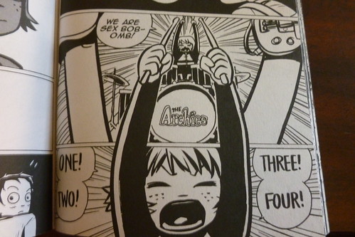
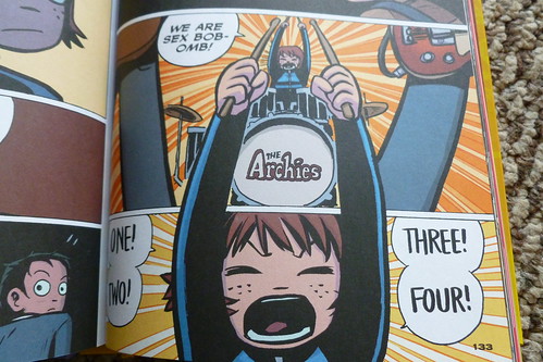
Story and dialogue-wise, there are no changes (that I noticed), but you do sometimes get a little more nuance or expression thanks to the addition of color. For example, I think the panel where Stacey is yelling at Wallace for stealing her boyfriend looks more angry in B&W, but more exasperated and/or embarrassed in color thanks to how pink Stacey’s face gets.

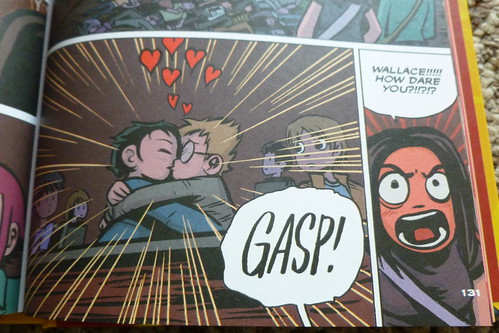
Then there are the other subtle details that my eyes never noticed in B&W. T-shirt designs, Ramona’s star-shaped ring, and even story things like the way that Knives’ clothes look like a palette swap of Kim’s as she gets more “scene”. Not to mention changing Julie so that she wears glasses in Vol. 1 as she does in later volumes.

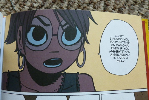
I’m sure that some of the detail noticing simply comes from this being my fifth (or so) reading of Scott Pilgrim, but I do genuinely believe that these little things pop a lot more thanks to the contrast.
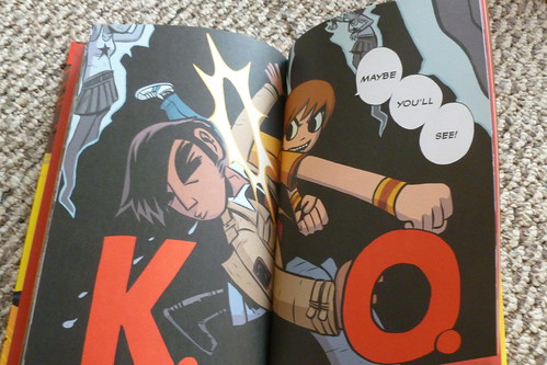
Then there are the things that are just executed better in color. My favorite example of this is the dream sequence where Scott’s playing a show while Ramona wanders by. In the monochrome edition the visual language of all of Scott’s dreams are conveyed by layering the white panels over an all-black page. Additionally, in this particular dream, O’Malley adds in these hazily defined lights and some looser pencil work that I think contrasts with his tighter lines (could be imagining this). In color he can still use the same motifs, but now he can also add a washed out, hazy look to his color selection. This page stands out more from the rest of the book as a dream in my eyes.


The last change to the book is the addition of even more behind the scenes information. I didn’t snap any shots of those since they are bonus exclusives to the book, but we’re talking concept art, reference photos, and commentary by O’Malley about the creation of the book. My favorite inclusion was the original pitch that O’Malley used for the book. It was neat to see what elements were dropped over the years and which ones he retained as more volumes came out. Very cool stuff.
My only gripe with this book has to do with credit. I get that it would be very unconventional to list a colorist’s name on the cover of a book, I suppose. Usually top billing goes to writers and pencilers/inkers, but when the major difference between the volumes is the inclusion of color…well I just feel bad that poor Nathan Fairbairn (who did fantastic work on this volume) gets credit only on the info page and the author splash in the back. I mean, at the very least couldn’t you just namedrop him in the summary printed on the back cover? “Now with colors by Nathan Fairbairn!” It’s a nitpick, but I just feel like he did great work and he’s not getting enough publicity for it.
That aside, guys, this book is awesome. I don’t care if you already have the B&W version of this volume, you should go and buy this. Now. Hurry.
Leave a Reply